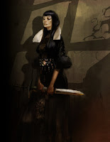
Shaun Tan is the illustrator and author of award winning children's books such as The Red Tree and The Lost Thing. He has received numerous awards for his picture books, including the CBCA (Children’s Book Council of Australia) Picture Book of the Year Award for The Rabbits with John Marsden. In 2001 Shaun was named Best Artist at the World Fantasy Awards in Montreal. He has recently worked for Blue Sky Studios and Pixar, providing concept artwork for forthcoming films.
visit Shaun's website
read the interview
Mr.Tan at wikipedia
Wednesday, December 26, 2007
Tuesday, December 04, 2007
Syd Mead on DVD
VISUAL FUTURIST: The Art & Life of Syd Mead,
contains exhaustive interviews with some of the greatest minds in design. Sharing their experiences working with Syd Mead in automotive, industrial, and film design. Listen to Syd Mead recall his influences and life tales of working on some of the largest projects the world has ever undertaken. Travel through the film projects such as Blade Runner and TRON with those who made the dream a reality behind the scenes. Director Joaquin Montalvan has created a brilliantly crafted documentary of Syd Mead that has left audiences all over the globe celebrating his crowning achievement.
buy the DVD here
visit Syd Meads official website
a gallery at the gnomon workshop
on-line gallery of his artwork
Tuesday, November 27, 2007
Revelations
Conceptart.org & Massive Black Inc.
The North American Art and Design Workshop: An event of 2D and design inspiration and a learning evolution which will fuel your creative fires this winter and beyond!
from January 4th till 7th, 2008
SEATTLE, WA USA
The North American Art and Design Workshop: An event of 2D and design inspiration and a learning evolution which will fuel your creative fires this winter and beyond!
from January 4th till 7th, 2008
SEATTLE, WA USA
Monday, November 26, 2007
The Structure of Man/Anatomy
On 5 DVD Volume Set
The lessons presented in ‘The Structure of Man’ with its 227 videos, contain 20 years of research and development into helping Artists rapidly grasp the complex structure of Human Anatomy for all areas of today’s Art fields.
http://the-structure-of-man.blogspot.com/
http://aboutthestructureofman.blogspot.com/
http://inventiontocompletehumanbeing.blogspot.com/
Tuesday, November 13, 2007
Rockwell vs. Leyendecker
J.C. Leyendecker: America's "Other" Illustrator
October 8-December 31, 2006
This illustrated presentation was given to The Haggin Museum's docent council by Director Tod Ruhstaller on Wednesday, Sept.27, 2006.
1:02:50 | 63.7MB | Requirements: Broadband, QuickTime |15 seconds to load
source
more about J.C.Leyendecker here
October 8-December 31, 2006
This illustrated presentation was given to The Haggin Museum's docent council by Director Tod Ruhstaller on Wednesday, Sept.27, 2006.
1:02:50 | 63.7MB | Requirements: Broadband, QuickTime |15 seconds to load
source
more about J.C.Leyendecker here
Tuesday, October 30, 2007
Craig Mullins: Gunman
STEP 1
Here is an excellent look into the early stages of Craig's work, beginning at how he establishes a loose sketch and progresses into how he lays out broad areas of light and shadow.
Draw your outline or silhouette in a mask channel so you can use it as a selection to paint through and behind throughout the process of painting.
STEP 2
Now go to your RGB color channel and make a gradation like you see here. I have in mind a dark green picture with a diffuse overhead source. Keep in mind the type of lighting when you make this grad, as it will direct everything you do from here on out. Don't go from very bright to very dark, you can do that later if needed. Of course you can experiment. Have fun, it can work, this is only one way.
Load your silhouette mask channel so that your figure is selected. Use the levels or curves to darken this area. Since you are darkening a range of pixels, you still have a nice grad in the figure, it is just on a lower scale.
STEP 3
Inverse your selection so the BG is selected. Using a paintbrush se to low opacity or using a wacom, make a few abstract shapes behind your figure to suggest something behind. I varied the color a little here and there. Keep the shapes big and general, no rendering yet. You can see that I made a lighter warmer grad at the bottom to indicate light hitting the floor. A soft blob for the shadow from the figure. I put in a vertical circular step to add a little dimension
STEP 4
Inverse your selection so the figure is selected again. I was losing the outline of the figure at the top, so I lightened it up a bit with a big soft brush. It is not really needed, but I thought it might help.
Now the form definition begins on the figure. You have the middle tone created by the initial grad, so now you have to go up in value and down in value to show the form as revealed by the overhead light. So the logic here is a surface that is horizontal is in halftone and will be left alone. The darks are surfaces that face downward or are recessed in between objects or anything that is in shadow. Block these in with nice big general shapes. Do not make them black, remember, we are working from the middle values out, we have not gotten to the dark darks yet.
STEP 5
Now go a little lighter than your midtones and any surface that faces upwards gets a lighter tone. I also added a few more darks here and there. Sometimes going lighter suggests where your darks can be refined a little more and vice versa. Work them back and forth. I also changed the basic tone of the weapons, as the would be of a different material from the armor suit. A little darker and a little cooler. Then do the darker and lighter block in procedure on the weapons as well.
Now you can make your darkest darks. The real darks come where surfaces come together and shade each other from all light, both direct and ambient. Also dark surfaces in shadow can go very dark.
STEP 6
Now go up to your lighter lights and you are about done. Now that all your major values are about where they should be, you can go on and render till you drop. I added a little definition of material to the floor. Keep in mind that you can keep any and all steps on separate layers if you want. Don't be afraid to work slowly at first. The better your block in the less noodling it will require later, and if you do detail it out, it will be on a solid foundation.(for more tutorials go to gfxartist.com or click here)
vistit Craig Mullins' website: goodbrush.com
Monday, October 15, 2007
WACOM challenge
The Wacom Challenge is about creating and sharing a skills-video that demonstrates your skills to achieve impressive results with a Wacom tablet. It provides an opportunity to showcase your innovative and original tips and tricks to a large audience, particularly when using a Wacom pen tablet in different applications and with other tools. Your skills-video can be about any application like for example digital photo, digital arts, manga, office or gaming.
for WACOM CHALLENGE click here,
to visit Wacom Europe's website click here
for WACOM CHALLENGE click here,
to visit Wacom Europe's website click here
Friday, August 10, 2007
Shadowline: The Art of Iain McCaig
McCaig is best known for his work as a principal designer on the three Star Wars prequels, including the iconic characters Queen Amidala and Darth Maul, as well as his work on many major motion pictures, television, and video games. His work can be seen in such acclaimed films as Terminator 2, Hook, Francis Ford Coppola’s Dracula, Interview with the Vampire, and Harry Potter and the Goblet of Fire. Some examples of his work are published on the Gnomon Workshop website.
The Book includes the following special features:
* A rare portfolio of more than two decades of McCaig’s masterful concept designs and storyboards
* Iain McCaig's private sketchbooks, personal paintings and more!
Order the book at AMAZON
The Book includes the following special features:
* A rare portfolio of more than two decades of McCaig’s masterful concept designs and storyboards
* Iain McCaig's private sketchbooks, personal paintings and more!
Order the book at AMAZON
Thursday, August 09, 2007
Ryan Larkin †2007
Ryan Larkin was a Canadian animator who rose to fame with the psychedelic 1969 Oscar-nominated short Walking and the acclaimed Street Musique (1972).
At the National Film Board of Canada, Ryan learned animation techniques from the ground-breaking and award-winning animator, Norman McLaren. He made two acclaimed short animated films, Cityscape and Syrinx, before going on to create Walking and Street Musique.
In recent years Ryan was plagued by a downward spiral of drug abuse, alcoholism and homelessness, but recently found himself back in the limelight when a 14-minute computer-animated documentary on his life, Ryan by fellow Canadian animator Chris Landreth, won the Academy Award for Animated Short Film and screened to acclaim at film festivals around the world. Alter Egos (2004), directed by Laurence Green, is a documentary about the making of Ryan that includes interviews with both Larkin and Chris Landreth as well as with various people who knew Ryan at the peak of his own success.
Ryan's Website, at Wikipedia, at CBC News
Monday, August 06, 2007
Tech 5 Engine
As an introduction to Tech 5 Carmack shows a quick demo loop of Rage in action, showcasing the texture work and graphical direction created entirely with Tech 5. The program, which is being developed hand-in-hand with Rage, focuses on what Carmack calls a "megatexture," which is essentially a term for the ability to mask an entire world with a unique, non-tiled texture system.
A developer can model the world, free-hand an entire massive piece of art, and lay it over the world itself, freeing up the processing power that goes to loading textures and pushing general graphical limits on the fly. From there developers can go into a new id-developed tool and work in a layer-based program to add unique features to their megatexture, clean up specific or entire chunks of the world, tweak bump/normal maps, and improve on the overall graphical output of the game.
Find a high res version of this video at gametrailers.com
Wednesday, August 01, 2007
Spidey's back
Kids' WB! has provided a first look at artwork from its upcoming The Spectacular Spider-Man animated series.
The series originally had the working title of Amazing Spider-Man, and the official announcement of the "Spectacular" title came the same week Marvel Comics announced the reduction of its Spider-Man ongoing titles to just Amazing.
Spectacular Spider-Man was a title that ran for more than 200 issues.
Here is the trailer for the upcoming Spectacular Spider-Man Animated Series from San Diego Comic Con 2007
Monday, July 30, 2007
Alberto Mielgo
Alberto Mielgo lives and works in London. You can find samples of his work published on his website at www.albertomielgo.com or on his blogs at blogspot.com
LE CUEILLEUR D’ASPERGES (graphic novel in development)
ALBERTO MIELGO's BLOG (personal work)
Saturday, July 14, 2007
Visual Development/Xiangyuan Jie
Xiangyuan Jie, has been working at the Disney and Fox Feature Animation studios as a background stylist and visual development artist. His screen credits include Mulan, Tarzan, Lilo & Stitch, Brother Bear, Ice Age 2 - The Meltdown.
You can find much more of his visual development work on his blog, including multiple versions of backgrounds, working sketches and color keys.
Xiangyuan Jie's website
and painting blog
You can find much more of his visual development work on his blog, including multiple versions of backgrounds, working sketches and color keys.
Xiangyuan Jie's website
and painting blog
Wednesday, July 11, 2007
Photosynth at TED Conference
This year Microsoft Live Labs Architect, Blaise Aguera y Arcas spoke at the TED(Technology, Entertainment, Design) Conference in Monterey, CA. Blaise demonstrated Seadragon and Photosynth to an enthusiastic audience and painted a vision for how these technologies will evolve in the months and years ahead. Watch the short video above to see some of the amazing ways these technologies will change the way you interact with your images in the future, and visit the Photosynth site to try the latest collections from the team.
Photosynth is a collaboration between Microsoft and the University of Washington based on the groundbreaking research of Noah Snavely (UW), Steve Seitz (UW), and Richard Szeliski (Microsoft Research).
Tuesday, June 19, 2007
American Art Archives
American Art Archives is pleased to be hosting the J.C.Leyendecker studies where you can see several examples of how Joseph's mind worked when designing the essentials of his advertising and slick cover work.
There's also a bit of mystery about the works (who doesn't like a good mystery?). Read all about it.
See more of Leyendeckers sketches and studies at illustrationart.blogspot.com
Leyendecker Art Gallery
There's also a bit of mystery about the works (who doesn't like a good mystery?). Read all about it.
See more of Leyendeckers sketches and studies at illustrationart.blogspot.com
Leyendecker Art Gallery
Tuesday, June 05, 2007
Favourite Blogs
Claudio Acciari, David Alcarria, Manuel Arenas, Hans Bacher, Pascal Barret, Laurent Beauvallet, Giacomo A. Bevilacqua,Luca Bonessi, Nicholas Bouvier, Laura Braga, Celia Calle, Eric Canete, Massimo Carnevale, Gigi Cavenago, Cristiano Cucina, Davide Decu, Eric Desideriu, Marko Djurdjevic, Benjamin von Eckartsberg, Colin Fix, Nathan Fowkes, Sean Galloway, Vassilis Gogtzilas, Todd Harris, Jesus Alonso Inglesias, James Jean, Xiangyuan Jie, Boris Kiselicki, Thomas von Kummant, Ed Lee, Francesco Lorenzetti, Alexander Lozano,Denis Medri, Alberto Mielgo, Dustin Nguyen, Emiliano Mammucari, Joshua Middleton, Peter Oedekofen, Gabriele Pennacchioli, Sara Pichelli, Peter Popken, Dermot Power, Daniela Raisig, Lou Romano, Neil Ross, Carlos Ruano, Robh Ruppel, Lucio Alberto Ruiz-Diaz, Armand Serrano, Mongsub Song, Silvio Speca,Marco Turini, Francis Tsai, Erik Tiemens, Josh Viers, Shelly Wan, Ashley Wood, Ryan Wood, Nate Wragg, John Watkiss, Wildstorm guys
more here!
more here!
Friday, June 01, 2007
Charley Parker’s
lines and colors is a blog about drawing, sketching, painting, artist tools and techniques. It features artists out of numerous genres such as comics, cartoons, illustration, digital art, concept art, motion graphics, animation, paleo art, storyboards, matte painting, 3d graphics and anything else of visual interest.
As long as it has lines and/or colors, it's fair game.
http://www.linesandcolors.com/
Thursday, May 31, 2007
Painting Process/Peter Popken
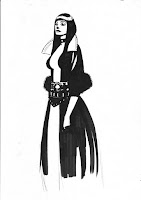
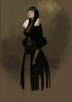
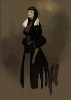
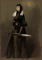
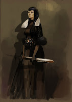
For those who are interested I uploaded some pictures showing a step by step painting process:
(1) I started off with a drawing I had done a long time ago. A simple marker sketch showing some basic proportions and an idea for a costume design. After opening it in photoshop I duplicated the background layer and set it on “multiply“.
(2) Underneath, on a third layer I started blocking in warm colors using a low key palette.
Sometimes it helps to look for color reference before starting on a whole new picture. Open it in a new window and pick the colors you like.
(3) I wasn’t really happy with the face so far and while fliping the image back and forth I realised that some of the features were slightly out of place. I decided to paint it all new and continued painting while constantly fliping the image and work either on the regualar or the mirrored image. Then I established a few cold colors in the reflections of the skin and hair.
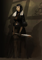
(4) I did the same to the dress and the sword: cold reflection from an imaginary window above and warmer ones from the light reflected from the floor. As you can see I also started to change the proportions of the whole figure by cutting and pasting parts I felt were too long or too short. Also the silhouette needed some more refinement.
(5) To give the whole picture a bit more dimension I thought the figure might cast a shadow on the wall behind. Further I had to check my values to not loose the silhouette of my character. I wanted the focal point to be around her face, collar and a few accents on the belt and sword. Thats why I saved the brightes tones for excactly those areas. The same goes for the amount of detail. Areas close to the center would get more attention than those further away. Some highlights and makeup are added to the face but the surrounding is treated more rough and blurry almost unfinished.
(6) To brake the vertical symmetrical composition I added a few diagonal shapes suggesting shadows casted by a light from above. In this case I put composition over realism and not trying to find out what is right but what looks good. Again lighter and warmer areas in the foreground and cold/dark areas in the background add a sense of depth to the image.
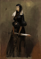
(7) Once the character was set up I decided to add some texture to the background. I chose an image of an aged wall I found on one of the various sides on the net, pasted it on a new layer with “overlay“ setting. The textures on the dress were painted with a simple round brush with “opacity“ set to “50%“.
(8) The trickiest part for me was her hands. I didn’t want to give them too much attention but then again they needed some more refinement since they play a big part in a characters personality. I changed the positions a couple of times and treated them like the face by fliping the image constantly. Keeping the allover value down helps to draw attention away from them.
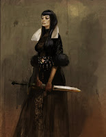
(9) After turning the background layer on again I cropped the image, merged the layers down and played a bit with the contrasts.
See the all of the tutorial at Peter's blog:
http://peterpopken.blogspot.com/
more info on his websites:
http://www.peterpopken.com/
http://peterpopken.jimdo.com/
Tuesday, May 29, 2007
The Illustration Academy
During the summers of the past several years, The Illustration Academy has brought together some of America's most accomplished and best-known illustrators to share their insights and advice with students. The students range in age from eighteen to sixty years old and have come from not only the United States, but as far away as Hong Kong, England, Belgium, Sweden, Brazil, and Argentina.
Unique to the illustration field is the fact that a graduating student is thrust into the market place and forced to compete with established illustrators. The mission of the Academy is to shorten the gap that exists between the student and the working professional. This problem is resolved using a rigorous hands-on approach implemented by the faculty. The students work through each assignment with a logical step-by-step approach to produce finished illustrations. Driven by real-world examples and deadlines, the students are encouraged to focus on concepts, techniques, and to pursue a personal point of view to make their work unique. Along side the technical demonstrations of media and life drawing skills, the Academy focuses on the functional business practices in the field of illustration. These include self-promotion, advertising, contracts, taxes and accounting.
website, lecture week info, samples
Ringling College of Art and Design
Attn: The Illustration Academy
2700 North Tamiami Trail
Sarasota, FL 34234-5895
Thursday, May 24, 2007
vyle-art/David Levy
Leading concept artist David Levy shows how to paint a piece that’s full of drama, using custom brushes to create a nuclear winter image.
Creating dramatic concept art means capturing the correct mood for your piece. The mood that I’m going to try to achieve in this workshop is one of a nuclear winter, which still has a poetic atmosphere to it. Opposing or contrasting ideas always make for great painting subjects, and a saturated winter is not a very common way to approach an image. With that rough idea and direction, we will let chaos direct the first part of the painting, then slowly give it a meaning and a more concrete perspective, lighting and mood(source: www.imaginefx.com)
visit Davids Website: http://vyle-art.com/
the tutorial: http://www.imaginefx.com/
more tutorials here
Friday, April 27, 2007
Reminder: FMX'07, Stuttgart, May 1.-4.
fmx/07 is organized by the Institute of Animation, Visual Effects & Digital Postproduction of Filmakademie Baden-Wuerttemberg
Animation studios, effect houses, game developers, production companies and postproduction facilities present their latest achievements. Researchers, hard- and software vendors and users debate new technologies and practical application. Creators, financial backers and distributors talk to each other and pitch projects. Graduates and freelancers meet recruiters looking for new talents.
Friday the 4th is a special day, not just for the party, but also for a full day of high-caliber presentations focusing on intelligent characters and the future of games with speeches from Electronic Arts, LucsArts, Midway Games, Lionhead and AIAS, about animation with indy producer Moon Seun and further talks by Pixar, Disney and Aardman, with vfx by Rising Sun, The Orphanage, Framestore CFC, Double Negative and MPC, and with D-Cinema talks by Thomson, Efilm, XDC and more. Topping it all off, Roland Emmerich takes the stage gives his own, personal view on the effect that effects and the digital process have on making films. Then – as mentioned above – business gives way to the final gong at the EA Closing Party.
Sony Pictures Imageworks is committed to the quality of fmx, contributing with four gloves-off contributions from one of the leading vfx houses in the world: high-end effects for Spider-Man 3, making waves in Surf's Up, house-baked performance capture in the new film Beowulf and the next step in 3D with stereoscopic feature films as experienced in the films Polar Express, Open Season and Monster House – including a screening of Monster House!
fmx review: interactive At fmx/07, games are more important than ever. New worlds are being created by professionals and consumers alike, the growth of parallel realities such as Second Life and World of Warcraft is unprecedented. Prestigious speakers talk about procedural animation and believable behaviors, the design and creation of interactive communities, convergence with games & the use of immersive technologies in film production as well as a look at the future of gaming and gaming technologies.
fmx/technologies: This series of talks on Wednesday, May 2nd highlights technology-driven trends and possibilities in animation: non-photorealistic animation offers new creative power to film-makers (Konstanz University and Def2shoot), in-game graphics get realtime – and interactive (NaturalMotion), creatures get hairy (Framestore CFC) and inter-active immersive environments get hyper-real – straight from the house of Crytek. Adobe Research also shows next-gen image editing ideas and Haggi Floeser-Krey casts light into the jungle of commercially available renderers.
Wednesday, April 11, 2007
Speed Racer
After years of trying to get going and numerous false starts, the live-action Speed Racer project is closer to moving forward. The Wachowski brothers, Larry and Andy, will co-write and direct the movie, with Joel Silver producing. It will be the first directing effort by the pair since The Matrix series ended in 2003 (which was also produced by Silver). Other behind-the-scenes talent will also reunite, including Oscar-winning visual effects supervisor John Gaeta. The film will be based on the classic 1960s animated series featuring the adventures of race car driver Speed and his gadget-laden car, Mach 5. Other characters that will appear in the movie include various members of Speed's family and archrival Racer X.(Source: The Hollywood Reporter)
So far Emile Hirsch has been announced as playing Speed, with John Goodman as Pops, and Susan Sarandon as his mother (who did not appear in the cartoon).
www.speedracerlives.com
www.speedracer.com
Illustration by Sean Galloway
So far Emile Hirsch has been announced as playing Speed, with John Goodman as Pops, and Susan Sarandon as his mother (who did not appear in the cartoon).
www.speedracerlives.com
www.speedracer.com
Illustration by Sean Galloway
Tuesday, April 03, 2007
PIXAR's WALL-E
Disney and Pixar have set Wall-E, Andrew Stanton's next film, for a release date of June 27, 2008.
"WALL E" starts out on Earth in the year 2700. Which -- due to the horrible way that humans have treated this planet -- is now just one massive trash heap floating in space.Earth in fact has become so toxic that -- centuries before our story actually gets underway -- mankind has abandoned the planet. We're now all living aboard the Axiom, this massive spaceship that circles high overhead. Waiting for the day that the planet once again becomes inhabitable.
But the only problem is that mankind hired this enormous, inept corporation -- Buynlarge -- to supervise the clean-up effort. And that company -- in turn -- sent hundreds of thousands of robots down to the planet's surface to pick up all of the trash...read more(spoiler-warning!)
offical Pixar site
upcoming Pixar blog
blog featuring Pixar Animation Studio
Monday, March 26, 2007
Photoshop CS3 Beta Preview
When Adobe released the Photoshop CS3 public beta on December 15, 2006, lynda.com and best-selling author, Deke McClelland, released Photoshop CS3 Beta One-on-One Preview, a series of free video tutorials, which showcase the new features in Photoshop CS3.
lynda.com and Deke McClelland have now released expanded and comprehensive video training course available exclusively to subscribers of the Online Training Library(tm). This series is now available to subscribers and is listed below the free videos.
It teaches essential skills, such as making selections, retouching, and managing layers. It also teaches more advanced skills such as applying Layer Effects and styles, using Adjustment layers, and Smart Objects. New features to Photoshop CS3 such as Vanishing Point 2.0 and Smart Filters are also covered. Exercise files accompany the tutorials.
Download Photoshop CS3 beta here.
Friday, March 23, 2007
12th International Conference on Animation, Effects, Realtime and Content, May 1.-4.
Started thirteen years ago, fmx has grown into a leading event for Digital Content in Europe attracting visitors and speakers from all over the world. After a successful co-operation in 2006, fmx/07 will again run back-to-back with the Stuttgart International Festival of Animated Film (April 26 to May 01, 2007).
Animation studios, effect houses, game developers, production companies and postproduction facilities present their latest achievements. Researchers, hard- and software vendors and users debate new technologies and practical application. Creators, financial backers and distributors talk to each other and pitch projects. Graduates and freelancers meet recruiters looking for new talents.
Tuesday, May 1 The conference kicks off with a full day of lectures and events, many in cooperation with the 14th Stuttgart Festival of Animated Film (ITFS). The Animation Production Day presents business-to-business knowledge for producers and distributors while the fmx/conference deals with production aspects of animated television series and feature films. The day culminates in the joint ITFS awards ceremony and fmx kick-off.
Wednesday, May 2 fmx/forum kicks in with workshops and suites, fmx/expo exhibitors open their doors, fmx/recruiting begins hooking people up with people, the pitchings of European Talents takes place. fmx/review surveys the latest in interactive content creation with a keynote by Jean-Charles Hourcade, Thomson on new trends, markets and opportunities. fmx/conference starts with talks on procedural animation, new animated features, visual effects and non-photorealistic rendering.
Thursday, May 3 fmx/conference turns to the anatomy of characters with the Virtual Humans Forum, the Digital Cinema Day begins, Indian and other Asian companies take the spotlight, as do the Visual Computing Cluster and the Eyes & Ears Junior Showcase.
Friday, May 4 Games and Visual Effects are a main focus of fmx/conference, with an introduction by Joseph Olin of the Academy of Interactive Arts & Sciences. The Virtual Humans forum and Digital Cinema Day also continue, and the Adobe roadmap marks the focus of this year's flashconference.
fmx/07 is organized by the Institute of Animation, Visual Effects & Digital Postproduction of Filmakademie Baden-Wuerttemberg.
Tuesday, March 13, 2007
Alex Toth
Toth's contributions to the comics medium are not widely known among casual fans. He did much of his comics work outside the current mainstream of superhero comics, concentrating instead on such subjects as hot rod racing, romance, horror, and action-adventure.
His stint on Disney's Zorro is highly regarded and has been reprinted in trade paperback form several times and there are two volumes of The Alex Toth Reader published by Pure Imagination which focuses on his work for Standard and Western publishing, but otherwise the bulk of his shorter stories can be difficult to locate. Nonetheless, he is widely regarded as an "artist's artist" and is often lumped among such greats as Will Eisner and Jack Kirby as one of the undisputed masters of the sequential storytelling medium.
Journalist Tom Spurgeon wrote that Toth possessed "an almost transcendent understanding of the power of art as a visual story component", and called him "one of the handful of people who could seriously enter into Greatest Comic Book Artist of All-Time discussions" and "a giant of 20th Century cartoon design." He was formally inducted into the Jack Kirby Hall of Fame in 1990.
In the past few years he contributed to the magazines Comic Book Artist and Alter Ego writing columns titled "Before I Forget" and "Who cares? I do!" respectively. In 2006 Billy Ingram and James Counts of TVparty [5] produced a book titled "Dear John: The Alex Toth Doodle Book" cataloguing his correspondence with John Hitchcock, published by Octopus Press.
Alex Toth may be one of the world's greatest comic artist. His influence is seen in the work of talents as diverse as Jordi Bernet and Kevin Nowlan. The purpose of this gallery is to present his art in its purest form, uncolored and as it was originally drawn.
The Official Alex Toth Website
Monday, March 05, 2007
PAINTER™ Award
PAINTER™ showcases the world's finest digital artwork using Corel's® natural media painting program, Painter.
PAINTER exhibits 209 works by 135 artists across diverse categories such as Portraits, Concept Art, Fantasy, Editorial Illustration and Abstract art. The PAINTER Awards are selected by an industry renowned panel of Painter artists.
PAINTER is presented in a high quality volume consisting of 192 pages and is available at Ballistic Publishing in a leather-bound Special Edition and Soft Cover.
Take a look at the winning artwork here.
Tuesday, February 27, 2007
Free Photoshop Brushes
Every good designer needs an arsenal of brushes to use within photoshop, whether its a grunge effect or some tehno swirls that are required there is sure to be a brush that fits your needs. Here The Tutorial Blog has dugg out the very best they could find. If there isn’t a suitable brush, we have also included some links on how to create your own.
Friday, February 23, 2007
Peugeot Design Contest - The Winners
Design is first and foremost a story of passion, which we have had at heart over the six years of sharing with you. With the 4th edition of the Peugeot Design Contest, the adventure continues. It is the free expression of tomorrow's talents and imagination is its motor. Car design fans, take up again the challenge offered to skill and talent. The great winner
Friday, February 09, 2007
Concept Art - The Corpse Bride
Neil Ross is a production illustrator, designer and art director. He has worked extensively in film and television, contributing to projects including Braveheart, Space Jam, An American Tail 2, Pinocchio, Tarzan 2 and numerous commercials. Some of his concept art for The Corpse Bride is posted on this Blog.
Neil's website his blog deadstown
Friday, February 02, 2007
Storyboard: Tony Wright
Tony Wright works in the film industry as a storyboard and concept artist. Some of his credits include Harry Potter, Cold Mountain, Star Wars: Episode I, The Avengers, Lost in Space, to mention only a few. In the past he was working as an illustrator for magazines such as Melody Maker, The Times, The Observer, The Mirror and a selection of other periodicals. Some of this work is published on his blog.
Here is a storyboard sequence he did for HARRY POTTER & THE GOBLET OF FIRE directed by Mike Newell. It is a version of the final sequence in the graveyard, where Harry is ensnared by Wormtail in preperation for the reinvigouration of Valdermort.
Tony`s rendering style has a wonderful graphic quality to it, still being clear about three dimensional shapes. Using dramatic light and shadow creates atmospherical sceneries. He seems to work primarily digitally, usually in Photoshop and Painter, using a Wacom Intuos tablet for drawing. Click here or image above to see the storyboard
Thursday, January 25, 2007
Digital Set Design - Tino Schaedler
Based in London, Tino Schaedler is a former Architect who has transitioned into the visual effects industry. Having worked for such firms as Daniel Libeskind and Barkow Leibinger, Tino has expanded his skills and has now worked as a digital set designer and art director on many well known films including Charlie and the Chocolate Factory, V for Vendetta, and Harry Potter.
Tino has an academic background in architecture and visual effects. He graduated from the University of Hannover in architecture with honours, studied at the Berlage Institute in Amsterdam, the University of California Berkeley in the U.S. and at The Art Institute of Vancouver. He has taught at the University of Fine Arts in Berlin, the architecture department of the University of British Columbia and the Architectural Association in London. He is currently working on a book and is planning to curate a traveling exhibition on contemporary film design. Read the interview on cgarchitect.com and baunetz.de
www.tinoschaedler.com
Tuesday, January 23, 2007
Illustration - John Berkey
As a staff artist at the Brown & Bigelow advertising firm for eight years, John Berkey produced more than 500 calendar images, featuring everything from pastoral scenes to historic tableaus, before turning to freelance illustration in 1963.Renowned for his robust and impressionistic style, he has created paintings for book covers, movie posters, advertisements, and such periodicals as National Geographic, Life, Time, and TV Guide. Among those attracted to his masterful science-fiction illustrations was the young George Lucas, who commissioned him to work on the pre-production designs for Star Wars. His images appear on 16 U.S. stamps.
gallery 1 gallery 2 buy book
Subscribe to:
Posts (Atom)