

Tuesday, February 27, 2007
Free Photoshop Brushes
Every good designer needs an arsenal of brushes to use within photoshop, whether its a grunge effect or some tehno swirls that are required there is sure to be a brush that fits your needs. Here The Tutorial Blog has dugg out the very best they could find. If there isn’t a suitable brush, we have also included some links on how to create your own.

Friday, February 23, 2007
Peugeot Design Contest - The Winners
 Design is first and foremost a story of passion, which we have had at heart over the six years of sharing with you. With the 4th edition of the Peugeot Design Contest, the adventure continues. It is the free expression of tomorrow's talents and imagination is its motor. Car design fans, take up again the challenge offered to skill and talent. The great winner
Friday, February 09, 2007
Concept Art - The Corpse Bride
Neil Ross is a production illustrator, designer and art director. He has worked extensively in film and television, contributing to projects including Braveheart, Space Jam, An American Tail 2, Pinocchio, Tarzan 2 and numerous commercials. Some of his concept art for The Corpse Bride is posted on this Blog.
 Neil's website his blog deadstown
 Neil's website his blog deadstown
Friday, February 02, 2007
Storyboard: Tony Wright
Tony Wright works in the film industry as a storyboard and concept artist. Some of his credits include Harry Potter, Cold Mountain, Star Wars: Episode I, The Avengers, Lost in Space, to mention only a few. In the past he was working as an illustrator for magazines such as Melody Maker, The Times, The Observer, The Mirror and a selection of other periodicals. Some of this work is published on his blog.

Here is a storyboard sequence he did for HARRY POTTER & THE GOBLET OF FIRE directed by Mike Newell. It is a version of the final sequence in the graveyard, where Harry is ensnared by Wormtail in preperation for the reinvigouration of Valdermort.

Tony`s rendering style has a wonderful graphic quality to it, still being clear about three dimensional shapes. Using dramatic light and shadow creates atmospherical sceneries. He seems to work primarily digitally, usually in Photoshop and Painter, using a Wacom Intuos tablet for drawing. Click here or image above to see the storyboard

Here is a storyboard sequence he did for HARRY POTTER & THE GOBLET OF FIRE directed by Mike Newell. It is a version of the final sequence in the graveyard, where Harry is ensnared by Wormtail in preperation for the reinvigouration of Valdermort.

Tony`s rendering style has a wonderful graphic quality to it, still being clear about three dimensional shapes. Using dramatic light and shadow creates atmospherical sceneries. He seems to work primarily digitally, usually in Photoshop and Painter, using a Wacom Intuos tablet for drawing. Click here or image above to see the storyboard
Thursday, January 25, 2007
Digital Set Design - Tino Schaedler
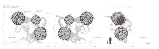 Based in London, Tino Schaedler is a former Architect who has transitioned into the visual effects industry. Having worked for such firms as Daniel Libeskind and Barkow Leibinger, Tino has expanded his skills and has now worked as a digital set designer and art director on many well known films including Charlie and the Chocolate Factory, V for Vendetta, and Harry Potter.
 Tino has an academic background in architecture and visual effects. He graduated from the University of Hannover in architecture with honours, studied at the Berlage Institute in Amsterdam, the University of California Berkeley in the U.S. and at The Art Institute of Vancouver. He has taught at the University of Fine Arts in Berlin, the architecture department of the University of British Columbia and the Architectural Association in London. He is currently working on a book and is planning to curate a traveling exhibition on contemporary film design. Read the interview on cgarchitect.com and baunetz.de
www.tinoschaedler.com
Tuesday, January 23, 2007
Illustration - John Berkey
As a staff artist at the Brown & Bigelow advertising firm for eight years, John Berkey produced more than 500 calendar images, featuring everything from pastoral scenes to historic tableaus, before turning to freelance illustration in 1963. Renowned for his robust and impressionistic style, he has created paintings for book covers, movie posters, advertisements, and such periodicals as National Geographic, Life, Time, and TV Guide. Among those attracted to his masterful science-fiction illustrations was the young George Lucas, who commissioned him to work on the pre-production designs for Star Wars. His images appear on 16 U.S. stamps.
gallery 1 gallery 2 buy book
 Renowned for his robust and impressionistic style, he has created paintings for book covers, movie posters, advertisements, and such periodicals as National Geographic, Life, Time, and TV Guide. Among those attracted to his masterful science-fiction illustrations was the young George Lucas, who commissioned him to work on the pre-production designs for Star Wars. His images appear on 16 U.S. stamps.
gallery 1 gallery 2 buy book
Tuesday, January 16, 2007
Peugeot Design Contest 2007
 Paris - Voici les 30 projets sélectionnés parmi les 4000 projets reçus. Vous allez maintenant prendre part au Concours de Design Peugeot en sélectionnant les 10 concept cars finalistes de la 4ème édition.
En cliquant sur un des projets, vous pourrez visualiser l'ensemble des visuels soumis par le candidat, ainsi que le texte de description du concept car.
www.peugeot-concours-design.com

PARIS — French automaker Peugeot is asking the public to vote online for their favorite from 30 entrants in the 2007 Peugeot Design Contest. The winning vehicle design in this fourth annual competition will be woven into a video game for Xbox 360, sponsor of the contest.
 Thirty design studies, chosen from 4,000 entries that came in from 113 countries, can be viewed on Peugeot's special contest Website. The deadline for voting is January 27. The winner will be announced at the Geneva Motor Show in March by Frédéric Saint-Geours, CEO of Peugeot, and the design will be built for a debut at the Frankfurt show in September — not to mention a debut as part of a future Xbox 360 auto-racing game. Read more... http://www.cardesignnews.com /forums
12th international conference on animation, effects, realtime and content

Started thirteen years ago, fmx has grown into a leading event for Digital Content in Europe attracting visitors and speakers from all over the world. After a successful co-operation in 2006, fmx/07 will again run back-to-back with the Stuttgart International Festival of Animated Film (April 26 to May 01, 2007).
 fmx is a platform for Animation, Visual Effects, Realtime and Content where experts and audience exchange ideas, experiences and insights on digital creation, production and distribution of the whole palette of digital imagery.
Animation studios, effect houses, game developers, production companies and postproduction facilities present their latest achievements. Researchers, hard- and software vendors and users debate new technologies and practical application. Creators, financial backers and distributors talk to each other and pitch projects. Graduates and freelancers meet recruiters looking for new talents
fmx/07 is organized by the Institute of Animation, Visual Effects & Digital Postproduction of Filmakademie Baden-Wuerttemberg.
Thursday, January 11, 2007
Digital Techniques - Craig Mullins
 Concept artist Craig Mullins has worked on some of the highest profile films and video games in the last decade.Based in Hawaii, he is employed to bring his artistic talents and imagination to bear at the early stages of game or movie development.
Mullins has worked as a matte painter on films such as The Matrix Revolutions, Armageddon, Apollo 13 and Forrest Gump; and concept visualization paintings for games like Halo 2, Marathon 2, Final Fantasy, GoldenEye: Rogue Agent and Prince of Persia. and is working as a concept artist on the film version of Philip Pullman's His Dark Materials, currently in pre-production.
He started as a commercial artist in 1986, producing paintings from architect�s plans. But his career path changed when he worked briefly at the world-famous special effects firm, Industrial Light and Magic. There he got his hands on one of the early editions of program Adobe Photoshop.
He was urged to try digital painting by no less than John Knoll, visual effects supervisor at ILM and co-creator of Adobe Photoshop.
His work is featured in the Expose 1 collection of digital painting from Ballistic Publishing, in which he was unanimously voted the first “Grand Master” award for that series. There is an article about him on the Ballistic site. There is also an illustrated article on the BBC News site.
See his website here(www.goodbrush.com)
 Some notes taken by Octavian during one of Craig's lectures at Gnomon
// Digital Techniques
Process by which he starts a painting always changes.
This time he started with a photo and smudged it (smudge tool had a scattering effect on it) leaving only an abstract palette.
The idea is to work from a middle grey value canvas. This way you only have to render maximum of 5 steps up to light, and 5 steps down to dark. Unlike a white canvas where you have to render down 10 steps to absolute dark. Working abstractly with shapes. Using only two values: a light value of about 3 and a dark value of about 7.
Keep working with only these two values until something emerges. (again, this is not to say that he works this way always as he says he always changes it up (and the idea behind this is that he figures since he can't change his way of thinking too dramatically, he figures no matter how he starts he'll always end up with "Craig Mullins" images))
Be careful not to put in too much contrast, not until last steps.
It is better to remain flatter in the beginning to keep the silhouettes clean. Also, keep to much texturing out of the early stages as it confuses the shapes.
Looking for design and composition first
 Tips on techniques:
-you can model something up in 3d, take a screen cap, and run a find edges filter over the 3d model. Set the layer to multiply and you'll have something to paint on that gives structure without too much variation (value?)
-some times bring up a canvas, like 500x800 pixels, marquee off little sections and do very small thumbnail roughs in there until something emerges. Then blow it up and paint.
-allow yourself a certain amount of time for brainstorming and creativity. Do not allow judgement to come during that time. At a particular time, look back at the brainstorm and then make decisions about where to go from there.
-Hierarchal significance for any color: 1. Value 2. Saturation 3. Hue
-Positioning of head mass relative to torso mass is a key relationship in the attitude of an illustration.
-To detail or "figure out" a section of a painting in a lower rez image; make a selection of what to detail, copy and paste in new file. Uprez the file by 1000% and paint all on a new layer. When done reduce file to 10% it's size, copy all the painting on the extra layer, paste back into original image (marquee selection should still be there though!)
www.linesandcolors.com
Monday, January 08, 2007
Spectrum Deadline January 26th!
spectrum 14 entry forms now online:
New Category Added (CONCEPT ART)!!
 The entry information and forms are available as printable PDF files (Acrobat Reader required) by clicking HERE. They will also be mailing out the actual Call For Entries poster to everyone on the mailing list starting this month and will continue until suppy is exhausted or the deadline for entries hits. A new category for “Concept Art” has been added to the competition this year. Jurors for this year’s annual are Mark Chiarello [Art Director for DC Comics], Marc Gabbana [illustrator/concept artist for such films as War of the Worlds and The Polar Express], Daniel dos Santos [artist], Dawn Murin [Art Director for Wizards of the Coast], Ragnar [artist/animation director], and Adam Rex [artist]. Make their job HARD! The more quality art that is entered, the more difficult the selection process — and, ultimately, the more definitive the Spectrum annual becomes. Let’s make this jury sweat! www.spectrumfantasticart.com
New Category Added (CONCEPT ART)!!
The entry information and forms are available as printable PDF files (Acrobat Reader required) by clicking HERE. They will also be mailing out the actual Call For Entries poster to everyone on the mailing list starting this month and will continue until suppy is exhausted or the deadline for entries hits. A new category for “Concept Art” has been added to the competition this year. Jurors for this year’s annual are Mark Chiarello [Art Director for DC Comics], Marc Gabbana [illustrator/concept artist for such films as War of the Worlds and The Polar Express], Daniel dos Santos [artist], Dawn Murin [Art Director for Wizards of the Coast], Ragnar [artist/animation director], and Adam Rex [artist]. Make their job HARD! The more quality art that is entered, the more difficult the selection process — and, ultimately, the more definitive the Spectrum annual becomes. Let’s make this jury sweat! www.spectrumfantasticart.com
...AH! Cover Art
 Adam Hughes is one of the greatest artistic contributors in the field of comics today. Primarily known as a 'good girl' artist, Adam has worked on a myriad of books. Some of Adam's credits include the Justice League, Legionnaires, Star Trek, Ghost and Gen 13 as well as doing countless covers and pin-ups for just about every comic company.
Currently, Adam is the monthly cover artist to DC Comics title CATWOMAN. He tours, appearing at close to a dozen conventions a year (see the appearances page for a list of this years shows).
Official site
'Things That Make You Go..AH!
bio and checklist @ wikipedia
Sunday, January 07, 2007
iPhone concept art
 Okan Vardarova has put together a huge collection of iPhone concept art over at his Apple iPhone blog. The art, which has been created by Apple fans, runs the gamut from the impossible to the brilliant to the absurd. In a way, it will be a huge let-down if Apple actually delivers on the iPhone at Macworld this January because it will cut off some of the most creative expressions of Apple fandom.
http://appleiphone.blogspot.com/
The Unofficial Apple Weblog http://www.apple.com/
Thursday, January 04, 2007
Blizzard Art Contest 2006: The Winners
 They received an incredible number of entries for last year's Blizzard Art Contest, with more than 3,000 outstanding submissions. Here are the galleries for the 2006 Blizzard Art Contest’s Grand Prize Winners and Honorable Mentions, featuring more than 100 pieces of artwork representing the Warcraft, StarCraft, and Diablo universes. http://www.blizzard.com/
Monday, January 01, 2007
Cover Art
Benjamin lives and works in Munich/Germany as a freelance illustrator for book covers. Further he wrote the scenario for "La Chronique des Immortels", a graphic novel based on the book by W.Holbein. See more of his work on here.

Sunday, December 31, 2006
Progressive Anatomy/John Watkiss
Essential for any artist studying anatomy.
The Progressive Anatomy book involves abstract reductionism of the body from head to foot page by page of all muscle grouping throughout this volume. It concludes with the big issue of composition and placing the figure intelligently on the page. With further references to knowledge over style. 8.5"x 11", Spiral Bound, 60 pgs

http://www.watkissart.com
http://johnwatkiss.blogspot.com/
The Progressive Anatomy book involves abstract reductionism of the body from head to foot page by page of all muscle grouping throughout this volume. It concludes with the big issue of composition and placing the figure intelligently on the page. With further references to knowledge over style. 8.5"x 11", Spiral Bound, 60 pgs
http://www.watkissart.com
http://johnwatkiss.blogspot.com/
Saturday, December 16, 2006
Structure and Function
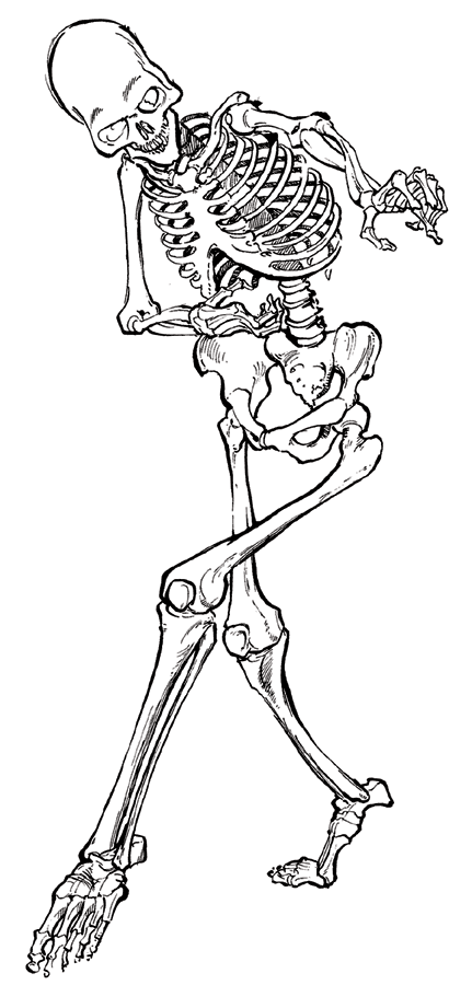 LEONARDO'S WAY OF TEACHING ANATOMY
One of the easiest ways to learn anatomy is to relate function with structure. Quite often, the anatomy is intimately connected to its function. Evolution has produced the most efficient structure for the maximum performance of the body. However, bodies are under constant change and as researchers look back at the history of the human, many structures have disappeared or become more prominent.
Leonardo’s originality as an anatomist is best revealed through his drawings and descriptions accompanying each of them. He did not believe in the use of too many words to describe his ideas. The few words he used were directly related to the drawings and expressed mechanical and technical ideas. For instance, he referred to muscles with words such as “springs” and “wires” in order to convey the idea of a machine.
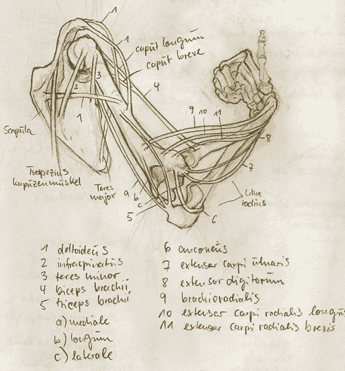
 The wires or cords are to indicate the lines of tension developed by the muscles as shown by his words:“...Make this leg in full relief, and make the cords of tempered copper, and then bend them according to their natural form. After doing this you will be able to draw them from 4 sides. Place them as they exist in nature, and speak of their uses.“
Leonardo's approach, with its notions of layers, levels, transparency, cutaways, sections opens up the body in a new way. Surface features and below the surface features are now integrated into the same process of understanding. But at the same time there is a curious way in which the new methods of visualization lead to a process of externalization: everything can be seen, brought out into the open, not just the insides of arms and legs, but also the inner organs and even the inner expressions of the mind and soul. There is a new belief that everything can be brought to the surface. Hence the study of anatomy, art and an early form of psychology emerge together in Leonardo's notebooks(Dr. Kim H. Veltman)
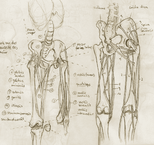
As a mathematical supplement, Leonardo’s detailed measures of every single part of the body emphasized his desire to normalize the human body. This calculated approach could relate to an eventual plan to create a human machine.(S.Pestieau)
Leonardo on the Human Body
 Leonardo Da Vinci's anatomical drawings, due to his extreme curiosity, became one of his most profound works to date. Published by Dover from the original text 1952. The book is set up in 2 columns and broken up into headers of different anatomical structures; either of bones, muscles, ventricles of the heart or brains. The chapters are broken into systems: nervous, cardiovascular, myological, osteological, respitory, alimentary and others. Within the text there are italicized words. These are the words written on the drawing itself, in Leonardo's usual backward writing style.
Some of you might be curious, beyond the drawings themselves to read what Leonardo thought at the time. And from there is the authors commentary. For those interested in anatomy, drawing, painting or anything in the art field, this book is highly recommended, for it has limitless reference value. I continually look at it for my drawings. One will also notice that many of the "models" are of the same body or person. This is because Leonardo asked a friend on his deathbed if he could cut him up, dissect him and then draw him. The friend, of course, consented to this, and so we have Leonardo's masterpiece.
More Links
Anatomy Image Bank
Web Anatomy
AndrewLoomis Anatomy
Photo Reference on Human Anatomy
Wednesday, December 13, 2006
Anatomy for Artists
 Burne Hogarth: Dynamic Anatomy
Exploring the expressive structure of the human form from an artist's point of view, this study describes the relationship of muscles and their effect on surrounding forms. The author demonstrates how to portray the anatomical details of the human figure in action and at rest.
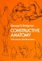 George B. Bridgman: Constructive Anatomy
Over 500 illustrations; instructional text. "Best book on artist's anatomy."-Art Students League News.
A variety of sketches depicting bone and muscle structure, as well as human features, illustrate these lessons in drawing human forms.
 Gottfried Bammes: Die Gestalt des Menschen
Künstleranatomie einst und heute, Leonardo - Anatom und Pädagoge, Michelangelos Verhältnis zur Anatomie für Künstler, Die Proportionen des Menschen, Die plastischen Bausteine des Körpers, Die untere Extremität, Das Rumpfskelett, Die Rumpfmuskulatur, Die architektonische Form des Rumpfes und seine Formzusammenhänge, Die besondere Oberflächenform der Hand in ihrer plastischen Bedeutung, Die Kopfgelenke und deren Mechanik, Die konstruktive Form und Plastik des Schädels, Die äußere Erscheinung des Kopfes, seine Oberflächenbildungen und das Körper-Raum-Problem, Die Verarbeitung des unmittelbaren und mittelbaren Ausdrucks des Gesichts in Porträts, Künstleranatomie und künstlerische Freiheit u.a.
Designers who Blog
‘Designers who Blog’ is about blogging designers. Due to the slop over in the industry, also included are illustrators, photographers, writers, advertisers, marketeers and more.
At ‘Designers who Blog’ you’ll discover people sharing thoughts, ideas and creativity about their industries. You’ll find off-the-rack blogs amongst well designed, amazing sites.
 http://www.designers-who-blog.com/
At ‘Designers who Blog’ you’ll discover people sharing thoughts, ideas and creativity about their industries. You’ll find off-the-rack blogs amongst well designed, amazing sites.
http://www.designers-who-blog.com/
Saturday, December 09, 2006
Job offer: Storyboard
Storyboards Inc. has represented the best artists in the business for over 25 years and we are looking for some fresh talent to join our team. We represent experienced artists who draw storyboards, shooting boards and comps for advertising agencies, commercial production agencies, and film production companies.Our client roster boasts top agencies all across the country.
We require you to have at least 3 years experience in the storyboarding business and would ask that you take a look at our website to understand the level of talent required.
Please be clear about what type of storyboarding you're interested in. We are not interested in finished illustration, fine-art work, figure drawing, or graphic design work.
Work can be submitted via email to ariam@storyboardsinc.com or on a CD.
We're based in Los Angeles, but rep artists across the country.

We require you to have at least 3 years experience in the storyboarding business and would ask that you take a look at our website to understand the level of talent required.
Please be clear about what type of storyboarding you're interested in. We are not interested in finished illustration, fine-art work, figure drawing, or graphic design work.
Work can be submitted via email to ariam@storyboardsinc.com or on a CD.
We're based in Los Angeles, but rep artists across the country.

Wednesday, December 06, 2006
PS3 Next Generation Games

 Assassin's Creed is a video game in development by Ubisoft. First shown as Project Assassin at Microsoft's X05 event, at the E3 2006 trade show, it was officially announced for the PS3, expected to be released in the first quarter of 2007 under the name "Assassin's Creed". Later on, Ubisoft also announced that the game was coming to the PC[1] [2] and Xbox 360 [3]. The game is being developed by many of the same people who helped make Prince of Persia: The Sands of Time, and began production as soon as the latter was completed.
One of the most talked about features of the game is the ability to get around the game world. Influenced by the Parkour phenomenon and its freedom of movement, the player will be able to grab onto and climb "any object that sticks out more than 2 inches", which means exploration of the cities, rooftops, etc. will be possible on a greater scale than in any previous game. The game will also be completely free-roaming, which has led to comparisons with Grand Theft Auto, The Elder Scrolls IV: Oblivion, Shadow of the Colossus, and other games.
Trailer

The Getaway
Some people bashed The Getaway on PS2 and its sequel, Black Monday, for its mildly broken play mechanics. But we really liked it. That's why we're excited to see what the talented chaps at Sony's Team Soho studio will be able to pull off when this astonishing PS3 tech demo, Getaway: Future Vision, becomes a fully-fledged Getaway 3 for PS3.
In the meantime, there's plenty to be excited about; the London-based developer has put together a stunning trailer based on the real-time demonstration that SCE's development chief, Phil Harrison, performed back at E3's press conference.
We're bringing you the usual high-quality, 60fps video quality so you can see just how staggering the demo looks. Depicting an early morning Piccadilly Circus, you'll see astonishing level of photorealism thanks to all the dynamic range lighting, pixel shading and probably a thousand other kinds of sophisticated graphical techniques. It's impressive. Source: KikizoGames


Trailer
Sunday, December 03, 2006
basic drawing skills
THE FRANK REILLY SCHOOL OF ART
The teaching program of Frank Reilly consisted of communicating an accumulation of knowledge and skills beginning with the elementary and building to the complex. He taught the crafts of drawing and then painting. The students first learns these necessary crafts before moving on to art. Craft has to do with developed skills and art with creativity and emotional connectivity. Each step in his lectures followed logically upon the step which had been previously taught. More...

Planes relative to the light...

Planes are concave, forms are convex.
The teaching program of Frank Reilly consisted of communicating an accumulation of knowledge and skills beginning with the elementary and building to the complex. He taught the crafts of drawing and then painting. The students first learns these necessary crafts before moving on to art. Craft has to do with developed skills and art with creativity and emotional connectivity. Each step in his lectures followed logically upon the step which had been previously taught. More...
Planes relative to the light...
Planes are concave, forms are convex.
Thursday, November 30, 2006
Things They Don't Teach in Art School
 "...Hitchcock, of course, is well known for his great character intros..."Lifeboat": An analysis of the beginning of the film is like a master class in beginning a film quickly and effectively. He gets across a lot of setup in a really compressed amount of time..."
Mark Kennedy (Storyboard Artist)
visit his blog: sevencamels.blogspot.com
Wednesday, November 29, 2006
from script to film
 From the same team who edited, wrote, and designed
THE ART OF THE MATRIX comes this similarly fashioned book
V FOR VENDETTA: FROM SCRIPT TO FILM.
Jammed with storyboards, concept art, director interviews, the script, posters, hundreds of photos, plus more, this is the only book to give you a first hand look at the making of the film, from the people who made it.
This is not a book with a massive print run, so… get it while you can!!
Preview it here. cover, back cover page1, page2, BUY NOW!

Sunday, November 26, 2006
Concept Design History I
Der Workshop ist ein Einführung in den Themenbereich Concept Design und möchte Einblicke geben in die Entwicklung komplexer Konzepte für die Filmgestaltung und verwandte Medien z.B.Games.
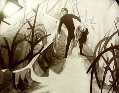
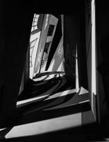 Die Erscheinung von „Caligari“(1926) leistete einen wesentlichen Beitrag zur Anerkennung des Films als eine eigene Kunstgattung. Das außergewöhnliche Production Design dieses Films zeichnete sich nicht nur dadurch aus die Handlung sinnvoll zu unterstützen sondern zugleich auch wirkungsvoll den expressionistischen Kunsttrend der damaligen Zeit wiederzuspiegeln.
 Robert Wienes Entwürfe dienten dabei als Concept Designs für die Filmarchitektur. Diese wird selbst zur Metapher und die Räume symbolisieren Schreie, Angst und Furcht.

concept sketch und stillframe von "Das Kabinett des Dr.Caligari"
 Überhaupt wird von nun an den Skizzen, Gemälden und Modellen der Set Designer eine größere Aufmerksamkeit zuteil und technische Neuerungen, wie Kamerabewegung, Überblendung und Montage bereiten den Weg für gestalterische Freiheit.
 Sorgfältig geplante Architektur wird nicht selten zu einem zentralen Bestandteil des Films(Metropolis 1927).
Dabei wird die reale Entwicklung der Architektur schnell überholt und dient als Experimentierfeld der solchen. Zukunftsvisionen und deren Design entpuppen sich als Kassenmagneten(Der letzte Mann/Asphalt).
Eine Entwicklung die bis in die 70er Jahre anhält und mit Star Wars(1977) seinen Höhepunkt erreicht.
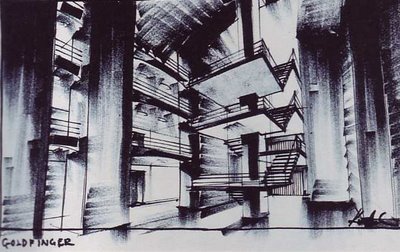 Ken Adam"Goldfinger"
 Eine allgemeine Enttäuschung durch die Resultate der Modern kippt die Zukunftsbegeisterung bald ins Gegenteil. Negative Utopien rücken in den Vordergrund und mit „Bladerunner“(1982) wird der Cyberpunk geboren.
 Ridley Scott setzt auf Reizüberflutung als Ausdruck des Grauens und überzeugt durch bildliche und assoziative Vielschichtigkeit. Die Wirklichkeit wird übersteigert aber nicht mehr idealisiert dargestellt.

concept art by Syd Mead
 Weitere interessante Stilmittel entstehen, wie zum Beispiel Paralleluniversen nach dem Motto: Was wäre wenn...(zB.)sich New York ohne Bauvorschriften Entwickelt hätte(Batman 1989), ... oder ... wenn die amerikanische Wirtschaftskrise oder der zweite Weltkrieg nicht stattgefunden hätten (Dick Tracy 1990, siehe auch Raymond Loewy, Luigi Colani)...etc.
Damit geht auch die Ära der traditionellen Filmeffekte zu Ende und die der am Computer generierten beginnt.


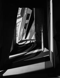 Die Erscheinung von „Caligari“(1926) leistete einen wesentlichen Beitrag zur Anerkennung des Films als eine eigene Kunstgattung. Das außergewöhnliche Production Design dieses Films zeichnete sich nicht nur dadurch aus die Handlung sinnvoll zu unterstützen sondern zugleich auch wirkungsvoll den expressionistischen Kunsttrend der damaligen Zeit wiederzuspiegeln.
 Robert Wienes Entwürfe dienten dabei als Concept Designs für die Filmarchitektur. Diese wird selbst zur Metapher und die Räume symbolisieren Schreie, Angst und Furcht.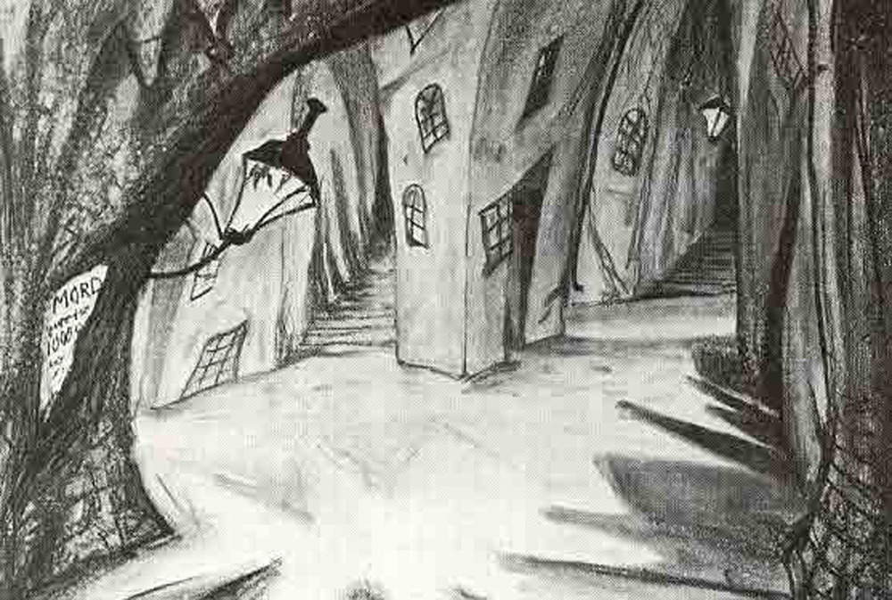
concept sketch und stillframe von "Das Kabinett des Dr.Caligari"
 Überhaupt wird von nun an den Skizzen, Gemälden und Modellen der Set Designer eine größere Aufmerksamkeit zuteil und technische Neuerungen, wie Kamerabewegung, Überblendung und Montage bereiten den Weg für gestalterische Freiheit.
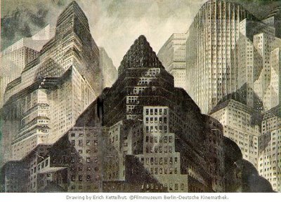 Sorgfältig geplante Architektur wird nicht selten zu einem zentralen Bestandteil des Films(Metropolis 1927).
Dabei wird die reale Entwicklung der Architektur schnell überholt und dient als Experimentierfeld der solchen. Zukunftsvisionen und deren Design entpuppen sich als Kassenmagneten(Der letzte Mann/Asphalt).
Eine Entwicklung die bis in die 70er Jahre anhält und mit Star Wars(1977) seinen Höhepunkt erreicht.
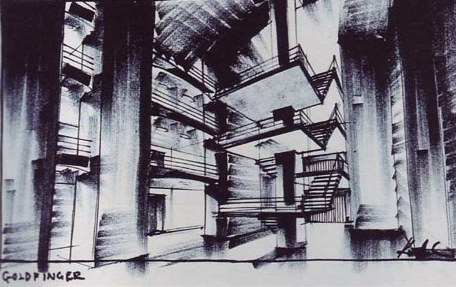 Ken Adam"Goldfinger"
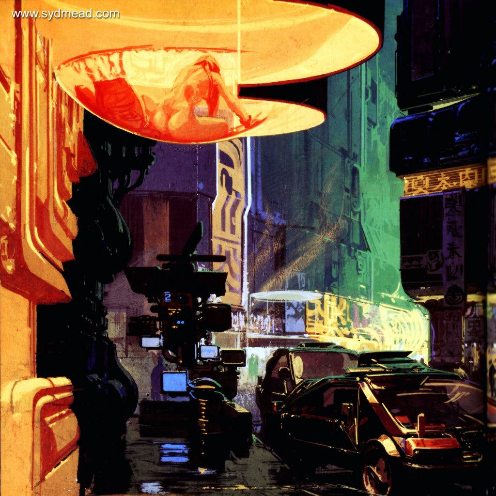 Eine allgemeine Enttäuschung durch die Resultate der Modern kippt die Zukunftsbegeisterung bald ins Gegenteil. Negative Utopien rücken in den Vordergrund und mit „Bladerunner“(1982) wird der Cyberpunk geboren.
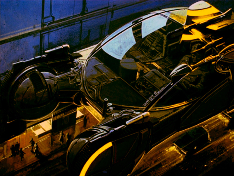 Ridley Scott setzt auf Reizüberflutung als Ausdruck des Grauens und überzeugt durch bildliche und assoziative Vielschichtigkeit. Die Wirklichkeit wird übersteigert aber nicht mehr idealisiert dargestellt.
concept art by Syd Mead
 Weitere interessante Stilmittel entstehen, wie zum Beispiel Paralleluniversen nach dem Motto: Was wäre wenn...(zB.)sich New York ohne Bauvorschriften Entwickelt hätte(Batman 1989), ... oder ... wenn die amerikanische Wirtschaftskrise oder der zweite Weltkrieg nicht stattgefunden hätten (Dick Tracy 1990, siehe auch Raymond Loewy, Luigi Colani)...etc.
Damit geht auch die Ära der traditionellen Filmeffekte zu Ende und die der am Computer generierten beginnt.

Subscribe to:
Posts (Atom)


 Posts
Posts


