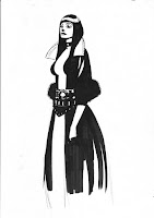
 For those who are interested I uploaded some pictures showing a step by step painting process:
(1) I started off with a drawing I had done a long time ago. A simple marker sketch showing some basic proportions and an idea for a costume design. After opening it in photoshop I duplicated the background layer and set it on “multiply“.
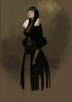 (2) Underneath, on a third layer I started blocking in warm colors using a low key palette.
Sometimes it helps to look for color reference before starting on a whole new picture. Open it in a new window and pick the colors you like.
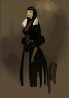 (3) I wasn’t really happy with the face so far and while fliping the image back and forth I realised that some of the features were slightly out of place. I decided to paint it all new and continued painting while constantly fliping the image and work either on the regualar or the mirrored image. Then I established a few cold colors in the reflections of the skin and hair.
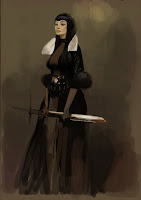 (4) I did the same to the dress and the sword: cold reflection from an imaginary window above and warmer ones from the light reflected from the floor. As you can see I also started to change the proportions of the whole figure by cutting and pasting parts I felt were too long or too short. Also the silhouette needed some more refinement.
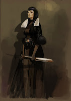 (5) To give the whole picture a bit more dimension I thought the figure might cast a shadow on the wall behind. Further I had to check my values to not loose the silhouette of my character. I wanted the focal point to be around her face, collar and a few accents on the belt and sword. Thats why I saved the brightes tones for excactly those areas. The same goes for the amount of detail. Areas close to the center would get more attention than those further away. Some highlights and makeup are added to the face but the surrounding is treated more rough and blurry almost unfinished.
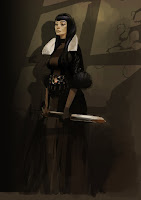 (6) To brake the vertical symmetrical composition I added a few diagonal shapes suggesting shadows casted by a light from above. In this case I put composition over realism and not trying to find out what is right but what looks good. Again lighter and warmer areas in the foreground and cold/dark areas in the background add a sense of depth to the image.
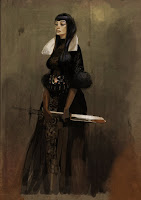 (7) Once the character was set up I decided to add some texture to the background. I chose an image of an aged wall I found on one of the various sides on the net, pasted it on a new layer with “overlay“ setting. The textures on the dress were painted with a simple round brush with “opacity“ set to “50%“.
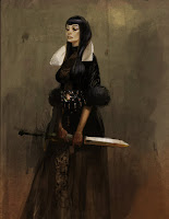 (8) The trickiest part for me was her hands. I didn’t want to give them too much attention but then again they needed some more refinement since they play a big part in a characters personality. I changed the positions a couple of times and treated them like the face by fliping the image constantly. Keeping the allover value down helps to draw attention away from them.
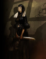 (9) After turning the background layer on again I cropped the image, merged the layers down and played a bit with the contrasts.
See the all of the tutorial at Peter's blog:
http://peterpopken.blogspot.com/
more info on his websites:
http://www.peterpopken.com/
http://peterpopken.jimdo.com/


No comments:
Post a Comment